Commuter Map Redux (England & Wales)
This post is all about the interactive commute map for England & Wales. You’d almost certainly rather play with that than read this.
In addition to spending a week in Italy on a somewhat deserved vacation, I’ve been working on some projects that haven’t made it here yet. I’ve neglected this blog a bit, but I have a few different things that will shortly come to fruition that I will post about soon. The commute map got picked up by Wired.com and then it exploded (to be clear, it exploded in a modest “map of commuters” way, not in a global dance sensation “Gangnam Style” way). At this point, I have over 300,000 page hits on the commute map page. See here for a list of all the wonderful online publications that helped to connect web surfers with my hypnotizing animated dots.
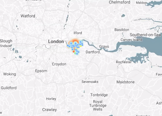
Now, like a hit movie that results in the inevitable sequel, a new version of the commute map is back that is hopefully more Godfather II than Phantom Menace. I’ve just published a new interactive commute map for England and Wales that is very similar to the original US version. This is fully thanks to my long-distance colleague Alasdair Rae who inspired the original commute map with his GIFs, and who recently contacted me to propose this new map using data he has available. Unfortunately, Scotland always has to be different and their data is issued separately with a different methodology. Having a Scottish wife and knowing many Scots well, I’m certain that their version, having been perfected when they undoubtedly first invented the concept of a commuter census, is far superior to the southern regions’ attempt.
Not sure there’s lot more to say that I didn’t say on the original posting about how it was put together. Obviously, in this case the data didn’t come from the US Census but from the UK equivalent. Instead of counties, this version uses Local Authority Districts (LAD) and instead of a census tract, it uses something called a “middle layer super output area” (MSOA) as the most granular level of geography.
To quickly reiterate, the page is published via .NET (C#) and pulls the data from a SQL Server table. Most of the work is actually being done in Javascript and uses a js-based animation library called Velocity. For this reason, despite great performance from Velocity, the more flows that are being animated the more performance can suffer (say 3,000+).
Please feel free to send me an email or leave a comment. Thanks for visiting!
2 thoughts on “Commuter Map Redux (England & Wales)”
Hey,
Great blog – I’m really enjoying the commuter map! Thanks!
Thanks, Rich! Glad you like it.