ACS Commuter Data Visualizations
This blog concerns an interactive visualization I put together that, for technical reasons, isn’t directly imbedded in this blog post. Go to http://bigbytes.mobyus.com/commute.aspx to see and play with the visualization.
A month or two ago, I ran across a compelling visualization of commuter data done by Alasdair Rae, a geographer and urban planner based at the University of Sheffield. He runs a very cool blog called Stats, Maps n Pix that focuses on geographically oriented data and related visualizations. His gifs were really compelling and hypnotic, and provided a great sense of where workers were living and working in metropolitan areas. While the data source size, at 4.1m rows, was not even remotely in the ballpark of what people consider “big data”, I’m also interested in visualizations and publicly available data that I could use to work on various “big data” style analyses. Alasdair mentions the idea of creating a version for the whole US in one of his blog entries, so I thought I would take a stab at it.
The commuter data is supplied as part of the ACS. The ACS is the “American Community Survey” and is an ongoing survey that replaced the US Census long form. The government makes this data available to the public to help non-profits, businesses, and government agencies better understand and target their plans and funding geographically.
Part of the ACS includes commuting information for those respondents in the workforce, detailing where the respondent works, lives, and the method of transportation. The lowest level of geographical detail for the ACS is the census tract which according to US Census Bureau defines an area of about 4,000 residents who have similar population characteristics. The data is available for download, either subsets using filters or the entire 4.1 million rows in an Access table.
There’s also a file of information about the individual census tracts that includes latitude and longitude (I assume the center of the tract) that can be used for mapping. I noticed a few missing tracts and I’m not sure why, but didn’t go back to figure it out.
These were the data I used to create the SQL Server tables that drive the visualization. The web app is built in C#/.Net and the data served, as I said, by SQL Server tables.
The actual map is done using the Google Maps Javascript API with a transparent div on top where the images of the dots are mapped using CSS (“top” and “left”) and the animation library Velocity to handle the back and forth motion. All the code is visible in the page source. Feel free to ask if you have any questions.
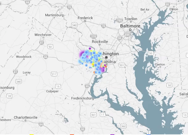
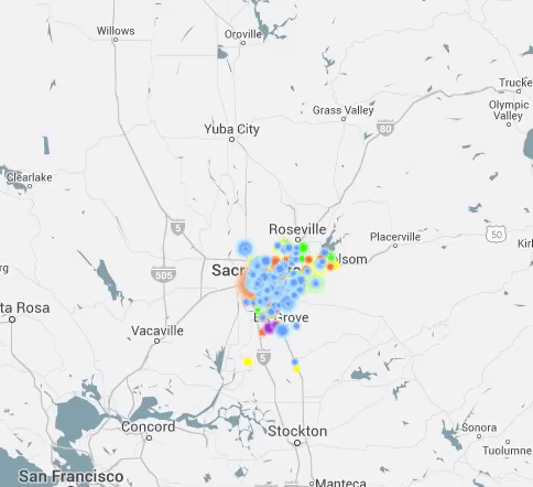
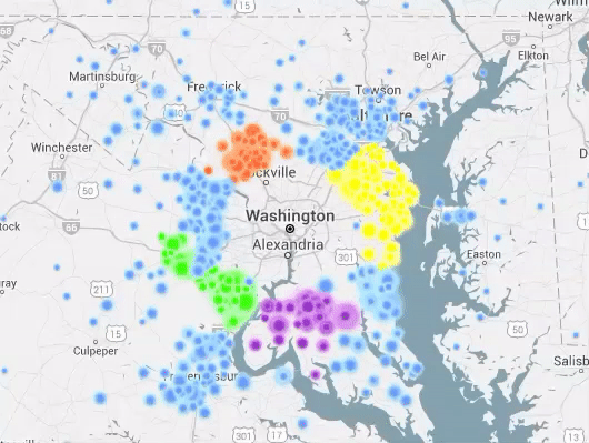
The resulting animations are somewhat hypnotic (even my dog seemed to go into a trance watching them leading to minutes of human amusement) but also provide a visual way of quickly seeing the distribution of workers into a given city. The points are sized based on the number of commuters, so a large dot indicates a higher relative number of commuters moving from the same tract to the same tract. The dots are also color coded to see which counties are most represented in the commuter sample.
To get more information on a given flow or workplace/home, pause the animation using the PAUSE/PLAY toggle and click on a dot. Options will appear for opening a tab in Google Maps to see either the home tract, the work tract, or the Google Maps driving directions between the two tracts. This can sometimes help to see that a large dot is focused on an airport or university as a workplace.
You also have the option to launch a tab in a great site called Loveland, based near my hometown of Ann Arbor in Detroit, that has detailed information on census tracts and will bring up a map of individual tracts so the size, shape, and contents of the tract can be examined.
More can be added, and please feel free to email me if you have any questions or suggestions. I appreciate you stopping by and taking a look.
37 thoughts on “ACS Commuter Data Visualizations”
It would be great to provide a way to link to a visualization. Any way you can expose the form variables used to generate the visualization in a URL?
Hey Aaron – yes, this was my plan but I kept adding stuff and a friend finally said “enough! it’s good enough!”. Given the popularity, I’ll probably do this as it shouldn’t be very difficult. Thanks for the suggestion!
Aaron – I added a way to share links that include the parameters in the url. If you click on “copy to clipboard” right below the “COMMUTE MAP” title you should get a link with the current settings in your clipboard that you can send. Please let me know if it works for you. Thanks!
The link to download the tract flow database now returns a 404 error, because of a bad security certificate (the download link is a secure “https” link). The good news is that it’s easily resolved by replacing “https” with “http”, at least until they renew or replace their certs.
Yes – that was happening when I was writing the entry so I originally included a note about it but then it seemed to go away so I took it out. Thanks for the note about dropping the “https”!
When I run it for Philadelphia (can’t speak for other cities), it shows that no one who lives in Philadelphia works in Philadelphia, which is blatantly wrong. Why doesn’t it show commutes within the city?
You might notice that there’s a label above the map (to the right) that shows that distance of commute are included in the query. The default is 20 to 100 miles. This is indicated in the notes as well. You can adjust this range by clicking on the “20 to 100 mi” label that will open a slider control that allows you to change the max/min miles included in the visualization. Thanks!
This is great!
I posted it on my page, but unfortunately the maps didn’t show up, so there is just a big empty box where there should be an image.
I really like this a lot, hope to see more geography-related things from you in the future.
Thanks for your interest. I really didn’t expect this level of attention. I’ve added some tags to add an image and description that will work better when sharing via Facebook. If you delete and reshare the link, it should now have an image (I just used an image of the New York City view) and a description. Thanks for stopping by! Cheers.
This is really cool analysis, I would be interested seeing similar gifs for my country (Australia). Especially considering our limited commute options in comparison to the US.
Great work. It would be even greater to aggregate this to the regional council/commission/planning district regions. This is particularly important for non-metro regions. I couldn’t do it with FIPS codes, so I developed a global geocode prototype. It should be developed open source. Let me know how to send you my Applied Geography paper. It also works for library management. I have a Wikipedia example. Cheers.
Thanks, Tom! I’d love to take a look. You can send it to my email address (mark@mobyus.com).
On the way from: Tom.Christoffel@gmail.com
nice work!
Is this from the 2014 ACS 5-year estimates?
Also – In case you didn’t know – you can get block level data of jobs and worker residence from the LEHD Origin-Destination Employment Statistics (LODES) program http://lehd.ces.census.gov/data/#lodes
although it uses an entirely different data source than the ACS, it might be something to check out as well.
Thanks, Jami! Someone just emailed me about that as well. I’m definitely going to look into it.
oops, forgot to answer your question. It is from the 2006-2010 estimates. I couldn’t find anything more recent at the tract level.
Thanks Mark!
again – great work – this certainly is an excellent visualization of the data.
I’ve been working a lot with the LODES data lately so would love to see if you do anything with that. I’ll have to keep an eye on your blog now.
Mark – this is awesome. Am looking forward to digging into what you’ve created here.
Thanks, Shirley!
Fascinating Mark! We can’t stop staring and sharing. You’re inspiring us to think about how clients can impact the patterns. Thanks from WeDriveU.
This is really cool!
The ACS has mode-share/transportation method data, right? I imagine it would be really cool to essentially see the rail lines traced out around NYC if set to transit, or to set it to bicycle mode and see the extent of a city’s bike-zone.
I’m please to see this graphic implementation. I worked at the Denver Regional Council of Governments (10 years ago), and we used to share this information with local governments in the Denver metro region. This map version can certainly reach more people and make the information easy to understand.
Respect is due Mark! Look forward to hearing a whole lot more about how you achieved this soon.
Box Elder County Utah is all messed up! the convergence spot west of the North Arm of Great Sale Lake is uninhabited and has only a few gravel roads and maybe one ranch pickup a day. Perhaps the location of ATK’s large plant was miss-identified there are 2 main gates 7 miles apart. 2 to 3000 people work there.
Hey Paul – Thanks for the comment. The data is aggregated by a geographical area called a census tract, and the dots are placed in the approximate center of the tract. Sometimes, low population areas can result in funny looking locations where the dot, representing the entire population of the tract, is placed somewhere odd. In this case, the tract is an unusual shape. You can see the actual shape here. My guess is that the commuters actually live on the east side of the tract where it wraps around the lake, but the geographic center of the tract is over on the west side. Hope that makes sense and answers the question. Let me know.
I would be extra cool to see each ‘commuter’ follow a google map route for their commute.
Michel – Thanks for the suggestion. I’ve thought about that myself, but that’s quite a bit more complicated than the “as the crow files” approach in the current version. I may take a look at the possibilities there. Thanks for visiting. Cheers.
What does CV stand for?
Coefficient of variance.
Is there a way to filter the map down to individual census tracts? I live in a commuter suburb of a major city, and it would be cool to see where my neighbors commute to.
Hey Jeff – Thanks for the question. Unfortunately, there isn’t a way to filter down the tract. If you set your home county and find your “dot”, you can click on it and view the “work tract” and the “home tract” either in Google maps or in the makeloveland.com map.
The potential problem might be that the dots will be stacked on top of one another, so might be tricky to click on any dot below the top one. You’d have to watch where they go and click there. Anyway, I thought about adding something like that, but hasn’t really come up much and I need to move on to other projects. If I come back to this one, I’ll add something where you can isolate a tract and see where all of the residents go (or the workers live depending on the view.)
Cheers. Mark.
Fascinating article! How could this historical data be used to predict new growth patterns related to where people choose to live? Is there a method for tracking the movement of a segment of a population on a weekly basis? I.e millennials traveling to city for entertainment purposes.
Hi Mark!
I sent you an email, but I’m working on a workforce project and was wondering if we could use your map on our website as a graphic to enhance our project? And if there is a way to embed it? This tool is fantastic and would really help drive the point home with our project. Thanks!
This is great data Mark. Is there anyway to show the heatmap based on the job category for which people were commuting? i.e Construction vs Engineering vs Healthcare etc?
Hey Rajan – Thanks for the note. I’m glad you like it. Unfortunately, the underlying data from the ACS is not broken out by job type. There are other sources of commuting info that might provide that dimension.
Thanks!
is this data for drivers of cars or for all commuters? including those taking trains and buses? thanks!
Pam – It is for all commuters.