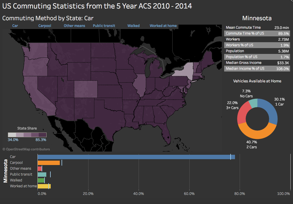
ACS Commuting Statistics Dashboard in Tableau
After creating the Tableau Web Data Connectors (WDCs) in the previous posts, I thought I’d learn how to create some basic visualizations in Tableau using them to extract US Census data. In keeping with another popular theme of the blog, I focused on the commuting data available in the US Census American Community Survey.
I’m not sure exactly what I expected from Tableau. It is really popular right now and is, no doubt, a slick presentation tool. Like any complex app, it has a learning curve and I can say that I did not find it intuitive at times. I frequently felt like I was having to really kludge or hack my way to doing what I wanted to do. After feeling like I was spinning my wheels, using it started to feel easier and easier as the concepts sank in. I got Tableau to do most of what I wanted it to do, but all too often doing things that felt as if they should have been simple weren’t at all.
To give but one example of this, I had a table with columns (as you do) and wanted the columns to have different, column-specific widths based on the contents and the heading labels. However, changing one column width changed all of them simultaneously and uniformly. After trying a few things, I searched and found this solution to having variable column widths in a Tableau table. It’s possible that I’m too used to Excel, but that surprised me.
In any case, there’s no doubt that Tableau has a lot to offer and provides an amazing data presentation toolset that is browser based. This is clearly why it is no popular and growing.
I’m not going to do a step by step on this, but if you have any questions at all on how I did this, please feel free to reach out to me. Click here to view the Tableau viz in a separate, dedicated tab.
A couple of quick things that I got hung up on with regards to effectively working in Tableau. One is that it is much, much easier to work with data that is organized downwards in rows rather than across in columns. For example, rather than a data table with columns for coffee sales, tea sales, soda pop sales with each row representing a day, it is much better to have a column for “Sales” and a column for “Category” where category is “Coffee”, “Tea”, or “Soda Pop” and there is a row for each Category/Day combination.
Secondly, know that when working with a Tableau dashboard, it will not know about any variable (measure value or measure name) that does not exist in the worksheet visualization or is listed on the “Marks” card. That last one is a bit specific, but was helpful once I got it.
Thanks for visiting! Email me at mark@ilikebigbytes.com if you have any questions.