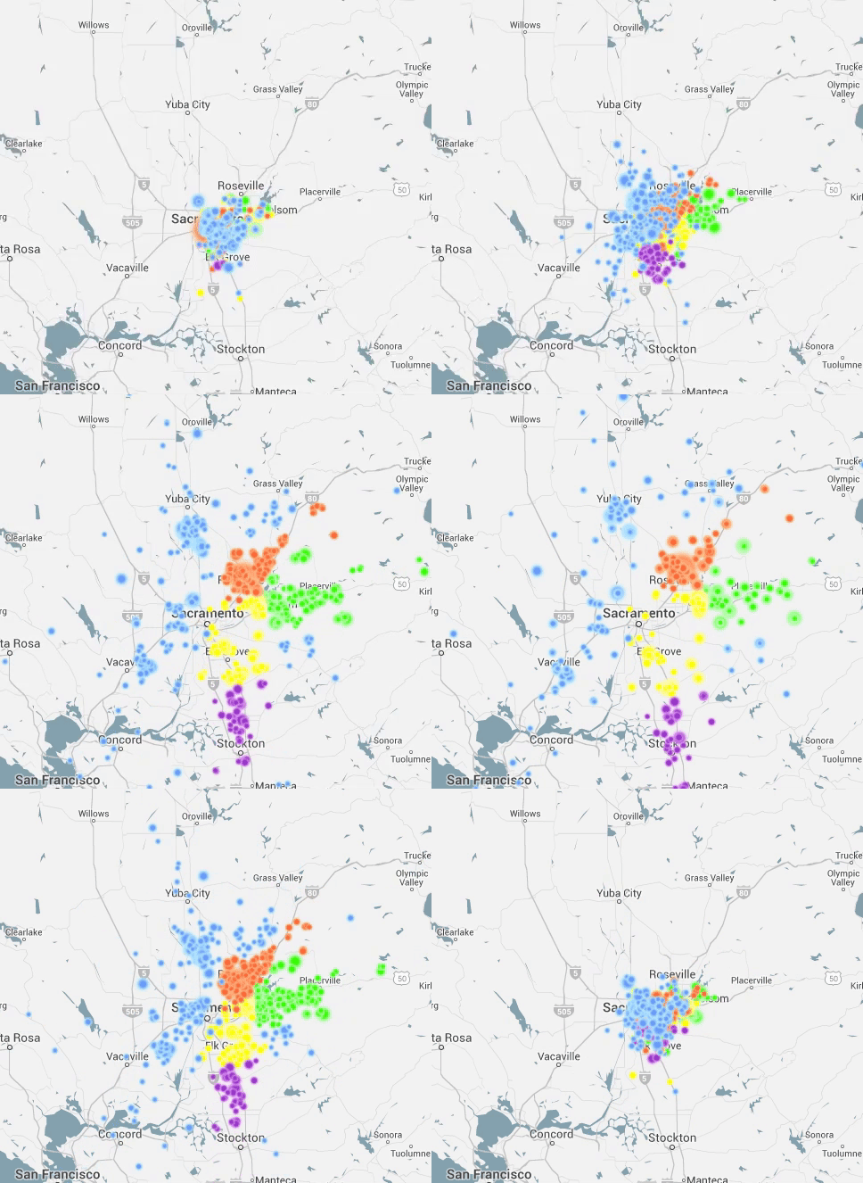
ACS Commuter Data Visualizations
This blog concerns an interactive visualization I put together that, for technical reasons, isn’t directly imbedded in this blog post. Go to http://bigbytes.mobyus.com/commute.aspx to see and play with the visualization. A month or two ago, I ran across a compelling visualization of commuter data done by Alasdair Rae, a geographer and urban planner based at the University of Sheffield. He runs a very cool blog called Stats, Maps n Pix that focuses on geographically oriented data and related visualizations. His…
